
Open Gradient & Mesh Builder in your browser to build smooth linear, radial, conic, and multi-point mesh gradients in perceptual OKLCH, compare against sRGB live, and export CSS, SVG, or 1080p PNG. Everything runs locally on your device with instant sync across the shared Active Palette bar.
Pick Linear, Radial, Conic, or Multi-Point Mesh
Select your gradient topology in the toolbar—Linear (with adjustable degree dial), Radial, Conic, or Mesh—and click along the stop bar to add, drag, or recolor stops from your Active Palette.
In Mesh mode, drag control points directly across the 2D stage to sculpt soft atmospheric hero backdrops.
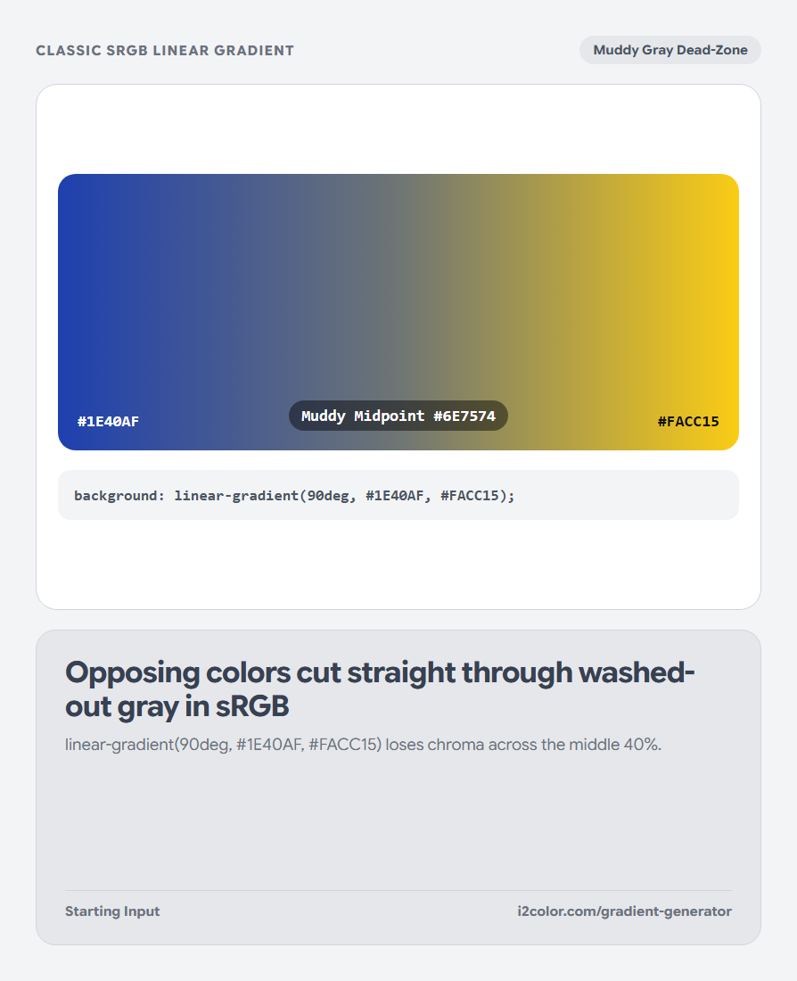
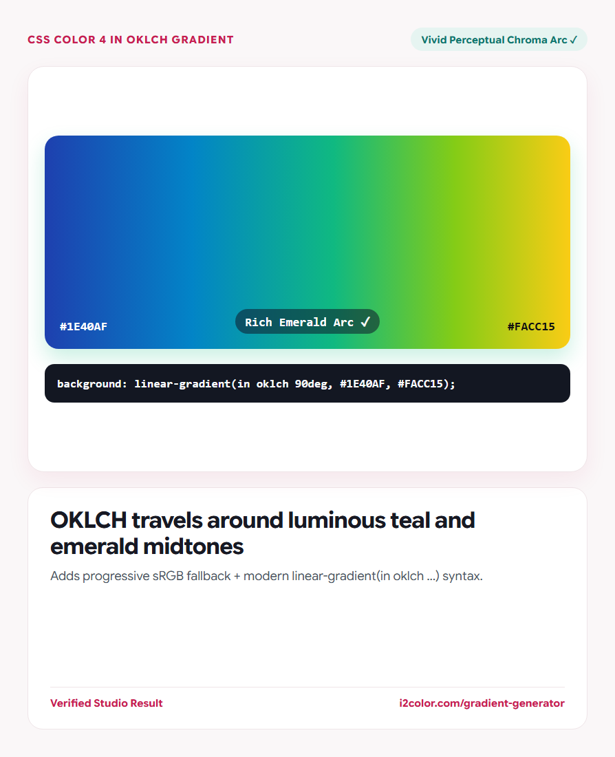
Side-by-side proof: Toggle between OKLCH and sRGB interpolation on opposing hues (like cobalt blue and warm gold) to see the gray dead-zone vanish.
Use CSS Color 4 in oklch interpolation
Enabling OKLCH adds the native in oklch color-space modifier to your CSS gradient, instructing modern browsers to travel around perceptual hue and chroma curves rather than cutting through muddy gray.
Adjust stop positions (`0%–100%`) to weight calm negative space behind headlines.
Linear & Radial (CSS)
Outputs progressive sRGB fallback + modern linear-gradient(in oklch ...) syntax.
Conic & Ring Sweeps
Ideal for subtle glossy border rings, progress dials, and spectrum wheels.
2D Atmospheric Mesh
Exports layered radial CSS or crisp high-resolution SVG/1080p PNG hero backdrops.
Export progressive CSS with sRGB fallback
Click Copy CSS to get a dual-declaration snippet that works on every legacy browser while upgrading automatically to mud-free OKLCH on Chrome, Edge, Safari, and Firefox—or download a lossless 1080p PNG.
.hero-surface {
  background: linear-gradient(135deg, #1E1B4B 0%, #C81E51 52%, #FB923C 100%);
  background: linear-gradient(in oklch 135deg, #1E1B4B 0%, #C81E51 52%, #FB923C 100%);
}Common questions
Is linear-gradient(in oklch ...) supported in all modern browsers?
Yes—Chrome 111+, Edge 111+, Safari 16.2+, and Firefox 127+ all support CSS Color 4 gradient interpolation natively.
How many color stops should a clean UI gradient use?
Two or three stops produce the cleanest transitions; when bridging hues more than 140° apart, adding one intentional middle stop gives you full creative control over the arc.
Can I browse ready-made OKLCH gradients for inspiration?
Yes. Scroll just below the builder stage or open Explore Gradients to browse curated Aurora, Pastel, Ocean, and Dark presets.
Try Gradient & Mesh Builder
Eliminate the gray dead-zone in linear, radial, conic, and mesh backgrounds.