

Open Tailwind Colors in your browser to generate uniform 50–950 OKLCH shade scales from one brand HEX or your full Active Palette and export Tailwind v4 @theme CSS, v3 config, SCSS, or JSON. Everything runs locally on your device with instant sync across the shared Active Palette bar.
Input your brand color or switch to Full Palette
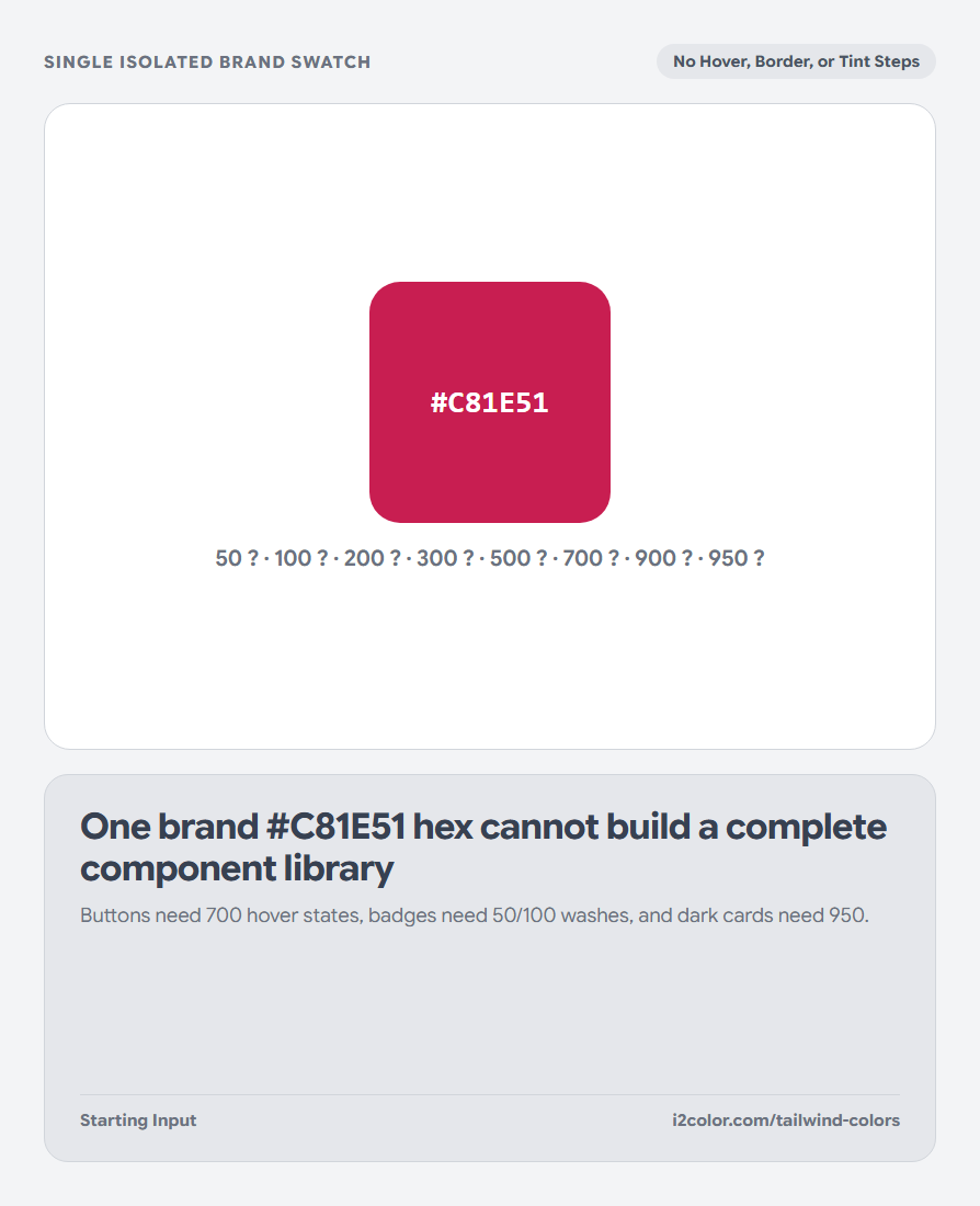
Paste your brand #HEX into the color capsule—or toggle from Single Scale to Active Palette to generate synchronized 50–950 ramps for every role in your palette simultaneously.
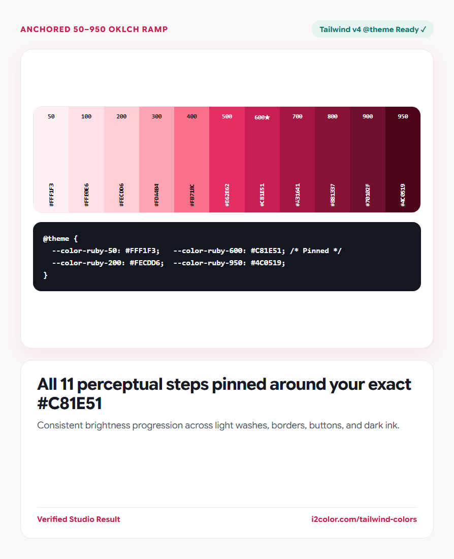
Your exact input HEX is automatically pinned to its natural perceptual lightness slot (for example 600 or 700) so your official logo color stays untouched.
Click any shade cell: Click any tile from 50 through 950 in the strip to copy its #HEX code immediately.
Follow the standard 50–950 Tailwind role convention
Because lightness curves in OKLCH match official Tailwind v4 palettes, utility classes behave predictably across components and dark mode.
Check that your 600/700 action steps keep crisp white-text contrast while 50/100 stay airy enough for subtle alert banners.
Tinted Surfaces & Borders
Use 50–100 for soft pill backgrounds and hover washes; 200–300 for hairline borders and rings.
Primary Interactive Fills
Use 600 for default solid buttons, 700 for hover states, and 500 for dark-mode active accents.
High-Contrast Text & Dark UI
Pair 900 text over 100 badges (AAA contrast), and use 950 for deep dark-mode card surfaces.
Copy Tailwind CSS v4 @theme or v3 config tokens
Select your target syntax—Tailwind v4 (@theme), Tailwind v3 JS, CSS Variables, SCSS, or W3C Design Tokens JSON—and click Copy Code.
@theme {
  --color-ruby-50:  #FFF1F3;
  --color-ruby-100: #FFE0E6;
  --color-ruby-200: #FECDD6;
  --color-ruby-500: #E62E62;
  --color-ruby-600: #C81E51; /* Exact Brand Anchor */
  --color-ruby-800: #881337;
  --color-ruby-950: #4C0519;
}Common questions
Why is step 950 included in addition to 50–900?
Tailwind CSS v3.3+ and v4 standardized the 11th 950 shade (~8–12% perceptual lightness) to provide rich dark-mode backgrounds without harsh #000000 black.
Does Tailwind v4 require tailwind.config.js for custom colors?
No. In Tailwind v4, pasting --color-* variables inside an @theme block in your main CSS automatically enables bg-*, text-*, border-*, and ring-* utilities.
Can I rename the generated token prefix?
Yes—edit the scale name (or find-and-replace the variable prefix) to match semantic roles like primary, brand, or accent.
Try Tailwind Colors
Turn any brand HEX into an 11-step perceptual ramp for Tailwind v4 and v3.