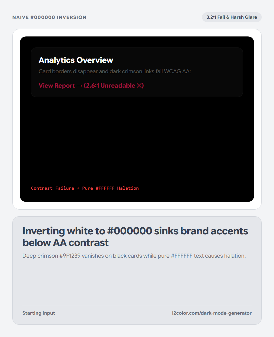
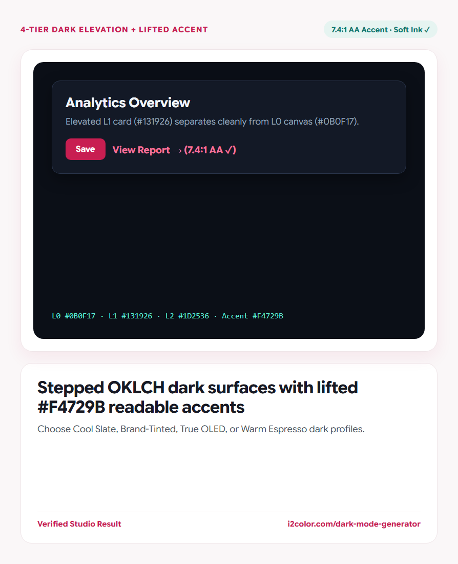

Open Dark Mode Generator in your browser to transform any brand color or light palette into WCAG-verified dark mode surfaces, elevated cards, borders, and balanced accents across 4 dark UI profiles. Everything runs locally on your device with instant sync across the shared Active Palette bar.
Pick your dark surface profile
Start from your Active Palette or brand #HEX and select one of four dark architectures: Cool Slate (modern developer/SaaS UI), Brand-Tinted (subtle 2% undertone from your primary hue), True OLED (deep power-saving obsidian), or Warm Espresso.
Inspect the live dark dashboard mockup to compare how cards, inputs, badges, and muted copy separate.
Elevation = Lightness: Because drop shadows vanish against dark backgrounds, higher z-index surfaces (cards → popovers → modals) should step progressively lighter.
Prevent halation and restore AA text/icon contrast
Deep saturated brand colors (`L ~ 45–55%`) look crisp on white paper yet vibrate or sink into dark cards. The generator lifts dark-mode accent lightness (`L ~ 70–76%`) and tempers excessive chroma while locking your exact OKLCH hue angle.
Primary body ink uses soft alabaster (#F1F5F9) rather than harsh #FFFFFF to reduce astigmatism halation.
4-Tier Surface Elevation
Generates Canvas (L0), Card (L1), Popover/Hover (L2), and Hairline Border (L3) tokens.
Contrast-Safe Accent
Guarantees dark-mode links, active tabs, and outline buttons clear 4.5:1 WCAG AA.
Dual Light + Dark CSS
Exports matched :root and [data-theme="dark"] custom properties ready for production.
Export semantic dark-mode custom properties
Click Copy CSS to grab your complete dark surface, text, border, and accent token set.
[data-theme="dark"] {
  --bg-canvas:      #0B0F17; /* Base Page L0     */
  --bg-surface:     #131926; /* Card Surface L1  */
  --bg-elevated:    #1D2536; /* Modal / Hover L2 */
  --border-subtle:  #29344A; /* Hairline Border  */
  --text-primary:   #F1F5F9; /* 15.6:1 Soft Ink  */
  --accent-readable:#F4729B; /*  7.4:1 Lifted AA */
}Common questions
Should solid primary buttons in dark mode use the lifted pastel accent or original brand color?
For solid filled buttons with white text, your original rich brand color (#C81E51) often still works great; use the lifted accent (#F4729B) for text links, icons, and active badges over dark cards.
Is pure #000000 recommended for OLED mobile apps?
Use near-black (#07090E to #0B0F17) for cards so borders remain visible, reserving pure #000000 for the deepest recessed background if desired.
Can I push the generated dark palette into Live Visualizer?
Yes—click Use in Palette to preview the dark scheme across all 10 boards in Palette Visualizer.
Try Dark Mode Generator
Turn light brand colors into layered dark surfaces without eye-straining vibration.