
Open Display P3 Builder in your browser to explore Display P3 wide-gamut colors on a 2D OKLCH boundary map, prevent hue drift on sRGB monitors, and copy progressive @supports / @media CSS. Everything runs locally on your device with instant sync across the shared Active Palette bar.
Plot Lightness × Chroma inside the sRGB and P3 boundaries
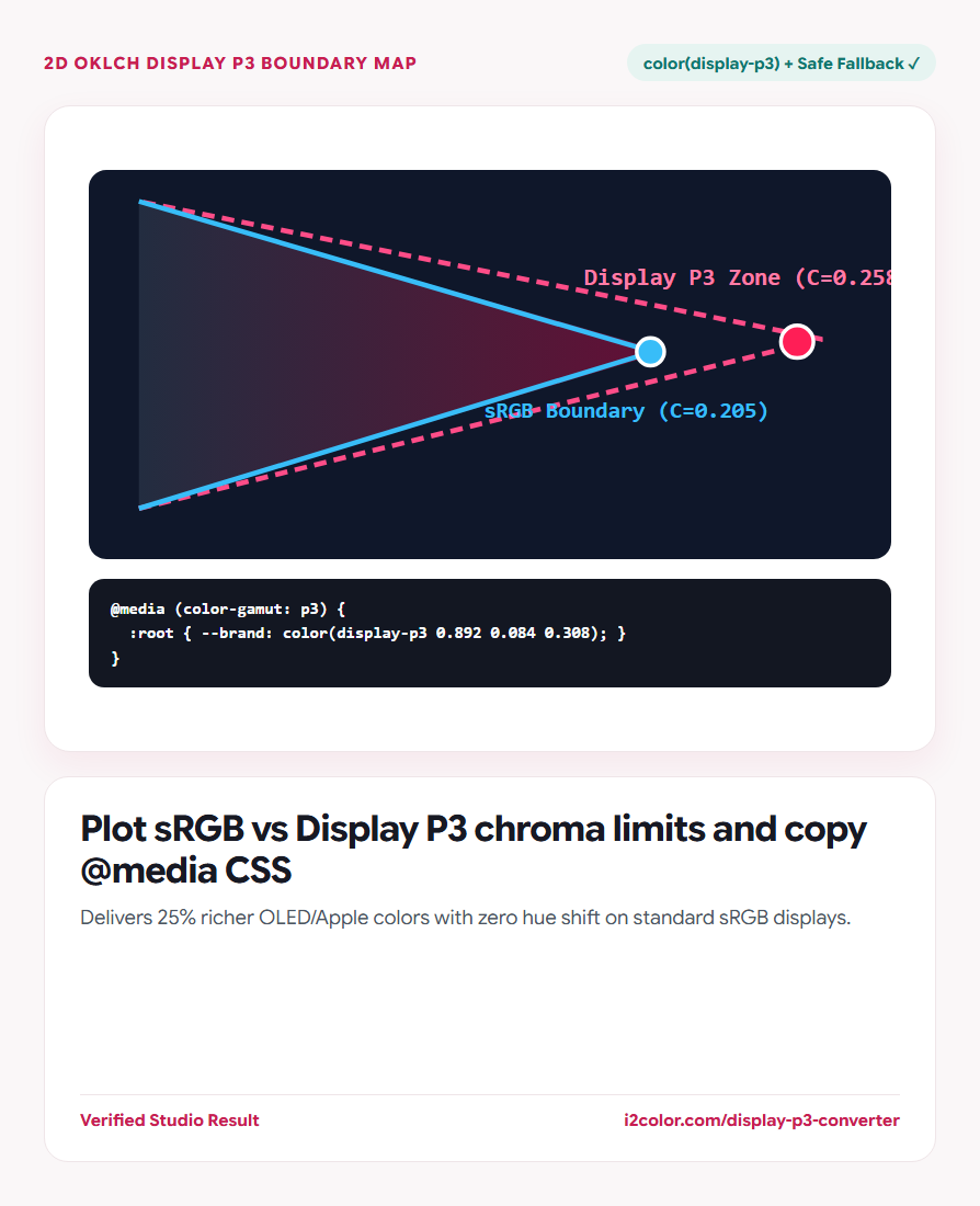
Select a hue angle or start from any swatch in your Active Palette. The 2D Lightness × Chroma canvas plots both the inner sRGB boundary curve and the outer Display P3 wide-gamut zone.
Drag into the outer P3 band to unlock deeper crimsons, electric corals, and lush emeralds visible on MacBooks, iPhones, iPads, and modern OLED phones/monitors.
Biggest P3 gains: Hues around 10°–35° (ruby/vermilion), 145°–165° (emerald), and 195°–215° (cyan) gain the most visible punch in Display P3.
Prevent hue shift on standard office sRGB monitors
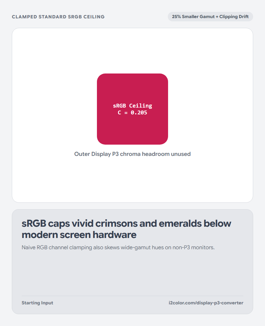
Millions of Windows/Linux office displays still cover sRGB only. Compare the Perceptual OKLCH Fallback swatch (which reduces chroma along constant hue until it touches the sRGB boundary) against harsh channel clipping.
Your brand identity stays unified whether viewed on an M4 MacBook Pro or a standard sRGB external monitor.
Display P3 Color Volume
Delivers richer brand accents and hero callouts on Apple, Android OLED, and HDR displays.
OKLCH Chroma Reduction
Computes the highest-chroma sRGB #HEX at the exact same lightness and hue angle.
Progressive @media Rules
Serves safe #HEX by default and upgrades automatically when (color-gamut: p3) matches.
Paste progressive wide-gamut tokens into your CSS
Click Copy CSS to export a clean progressive token block with sRGB fallback + @media (color-gamut: p3) upgrade.
:root {
  --brand-vivid: #D91B4E; /* Perceptual sRGB Fallback */
}
@media (color-gamut: p3) {
  :root {
    --brand-vivid: color(display-p3 0.892 0.084 0.308);
    /* Equivalent: oklch(55.4% 0.248 13.5) */
  }
}Common questions
Can I see the Display P3 difference on my current monitor?
If your display and OS color profile support Display P3 (such as macOS, iOS, or wide-gamut OLED Windows), the P3 swatch renders noticeably more vivid than the sRGB swatch live on page.
Why wrap wide-gamut tokens in @media (color-gamut: p3)?
It guarantees older browsers get a clean #HEX fallback and lets sRGB monitors use your hand-verified perceptual fallback instead of naive browser clamping.
Can Display P3 colors be printed in standard CMYK?
No—wide-gamut P3 neons exceed reflective CMYK ink; always soft-proof print materials separately in CMYK Gamut Checker.
Try Display P3 Builder
Unlock 25% richer crimsons, emeralds, and cyans on Apple & OLED screens—with safe sRGB fallbacks.