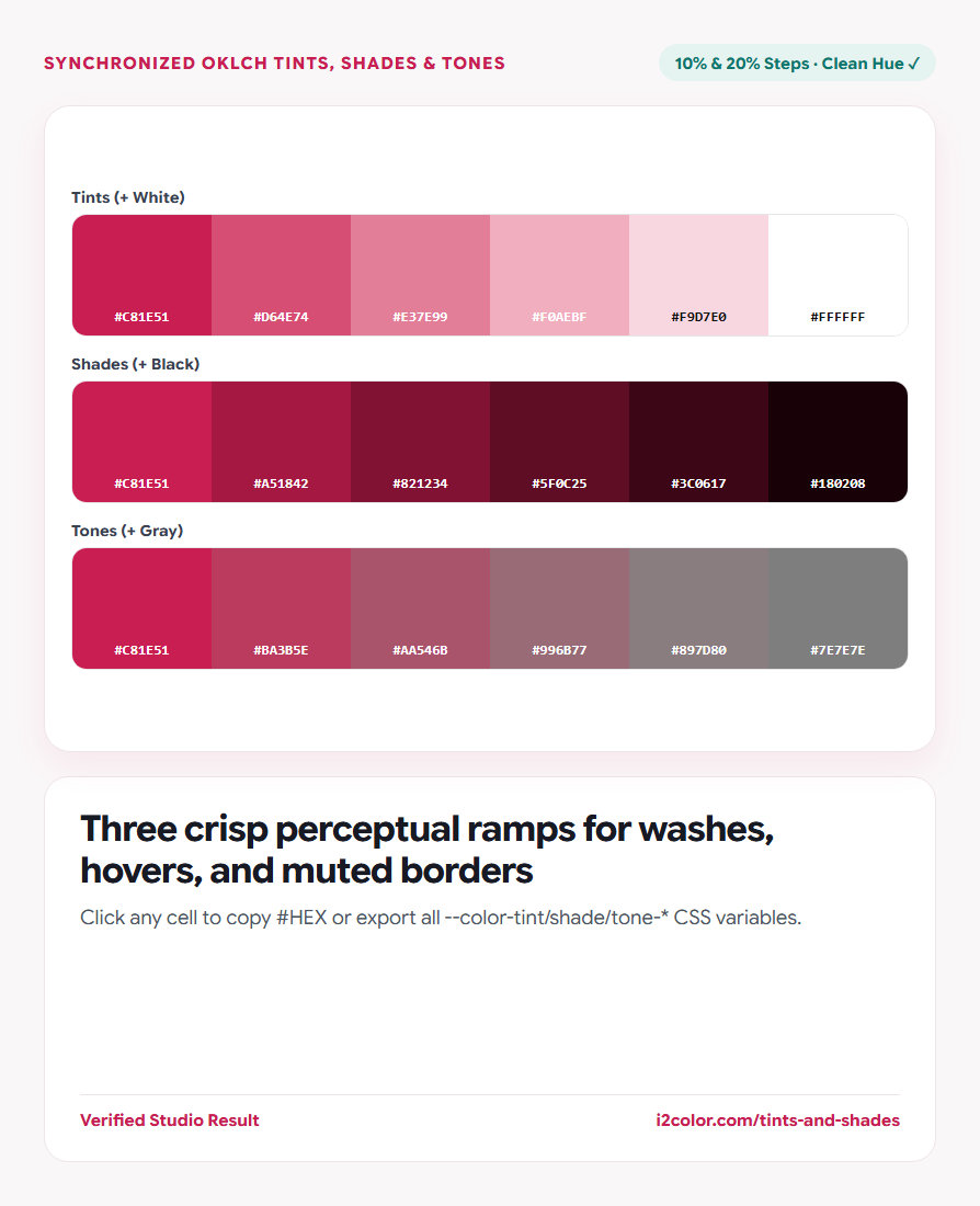

Open Tints & Shades Generator in your browser to generate 10% and 20% tints, shades, and muted tones from any HEX or OKLCH color, compare perceptual OKLCH vs classic sRGB mixing, and copy CSS variables. Everything runs locally on your device with instant sync across the shared Active Palette bar.
Pick or paste your base brand color
Enter any #HEX or oklch() color in the Select Color capsule—or click any swatch in your Active Palette bar above to inspect its tonal variations immediately.
Three synchronized strips render side by side: Tints (mixed progressively toward #FFFFFF white), Shades (toward #000000 black), and Tones (desaturated toward neutral mid-gray).
Quick UI rule: A 10%–20% shade makes a natural button :hover state, while an 80%–90% tint makes a clean soft badge background.
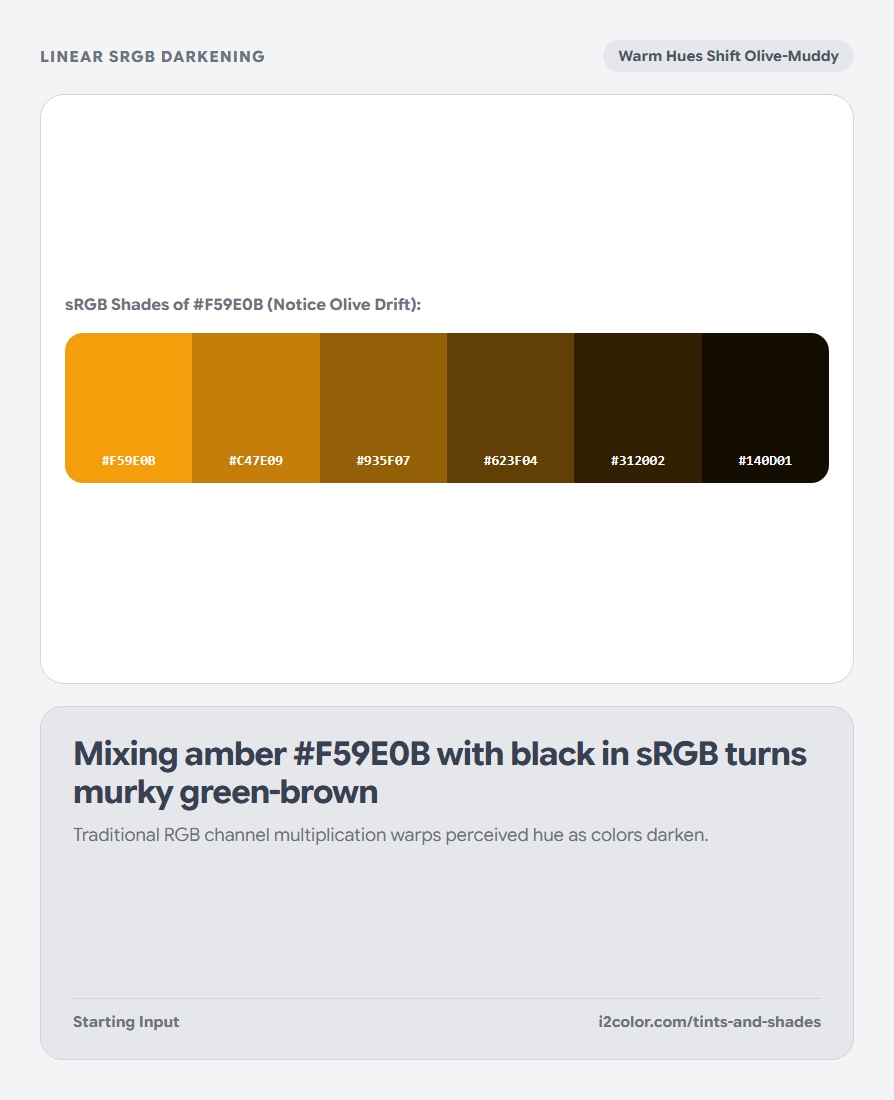
Compare OKLCH perceptual math against classic sRGB
Keep OKLCH active for modern UI design so hues stay clean across lightness extremes, or switch to Classic sRGB when matching legacy Sass mix(#fff, $color, $weight) functions.
Toggle between 10% (11 cells: 0%..100%) for granular UI state tokens and 20% (6 cells) for concise style guides.
Tints (+ White)
Lightens a color for soft alert banners, selected table rows, and pill backgrounds.
Shades (+ Black)
Deepens a color for button hover/active presses, dark borders, and readable badge text.
Tones (+ Neutral Gray)
Tempers high saturation into calm architectural surfaces and secondary UI chrome.
Copy individual hex steps or all CSS custom properties
Click any cell in the three strips to copy its 6-digit #HEX code, or click Copy CSS to export the complete set of --color-tint-*, --color-shade-*, and --color-tone-* variables.
:root {
  --color-tint-0:   #C81E51; /* Base Color       */
  --color-tint-80:  #F7CFD9; /* Soft Badge Fill  */
  --color-tint-90:  #FBE7EC; /* Subtle Wash      */
  --color-shade-10: #B11947; /* Button :hover    */
  --color-shade-20: #99153D; /* Button :active   */
  --color-tone-60:  #8F6A74; /* Muted Secondary  */
}Common questions
Why is 0% included at the left of every strip?
0% represents your unmodified base color so you can judge each progressive 10% or 20% shift directly against the original anchor.
What is 100% in Tints vs Shades vs Tones?
100% Tint reaches pure #FFFFFF white, 100% Shade reaches pure #000000 black, and 100% Tone reaches completely desaturated neutral gray.
How do Tones differ from lowering CSS opacity?
CSS opacity makes an element translucent so background textures bleed through; a Tone is a 100% opaque solid HEX with calmer chroma.
Try Tints & Shades Generator
Create clean 10% and 20% hover, border, and surface variations without hue drift.